Redesigning an e-commerce platform to enhance both the user interface and experience, creating a
seamless and intuitive shopping journey.
End result
15 Responsive Screens
Duration
2 Months
Prototype
Tools used
Goals
Expand Sales
Increase the brand's sales by redesigning its website and giving it a relevant look.
User Friendly
Improve the user experience to be more clear, conventional and user-friendly.
Trustworthy Website
Build a strong foundation for the website, ensuring transparency and reliability.
Challenges
Disorganized purchase process
No pictures
No categories
No shopping cart
Costumer details before choosing the products
Nonfunctional user experience
Button ineffectiveness
Unorganized Wireframes
Disorganized and chaotic user flow
Problematic visual language
Excessive use of color pallete
Irregular usage of capital letter
Incorrect usage of font weight
Use of multiple fonts
Solutions
Fixed visual language
Attractive color pallet
Clear text
Typography Consistency
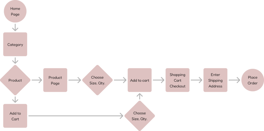
Organized purchase process
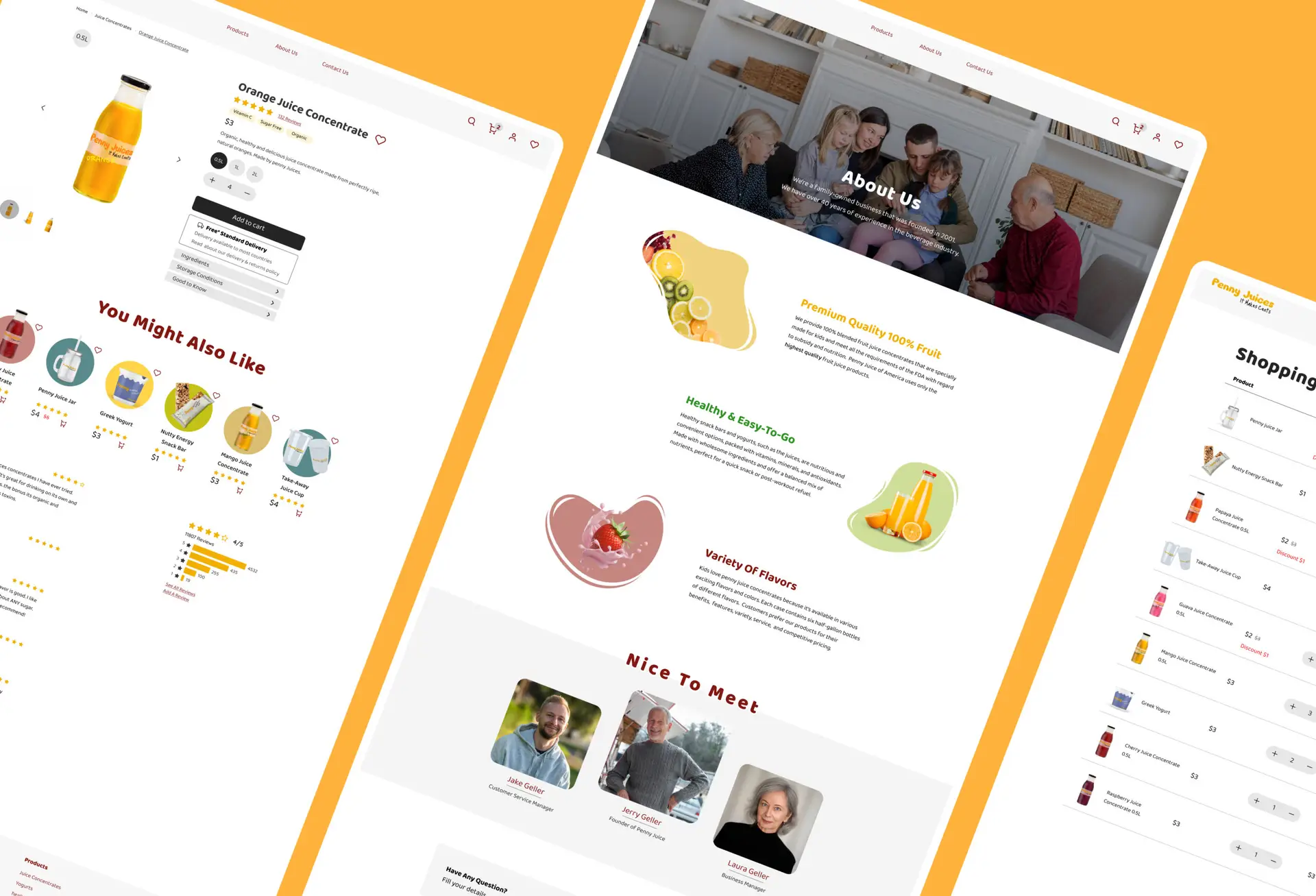
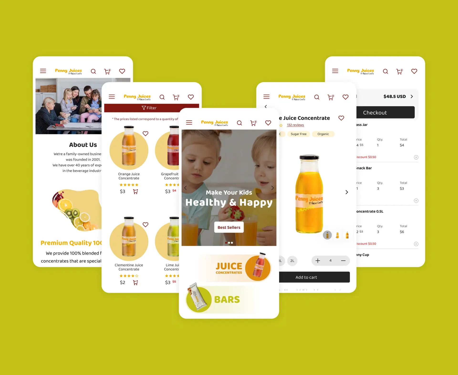
Product pictures
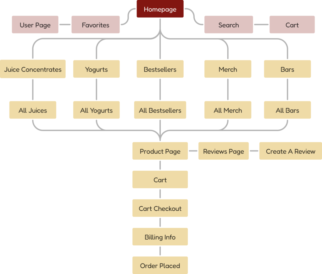
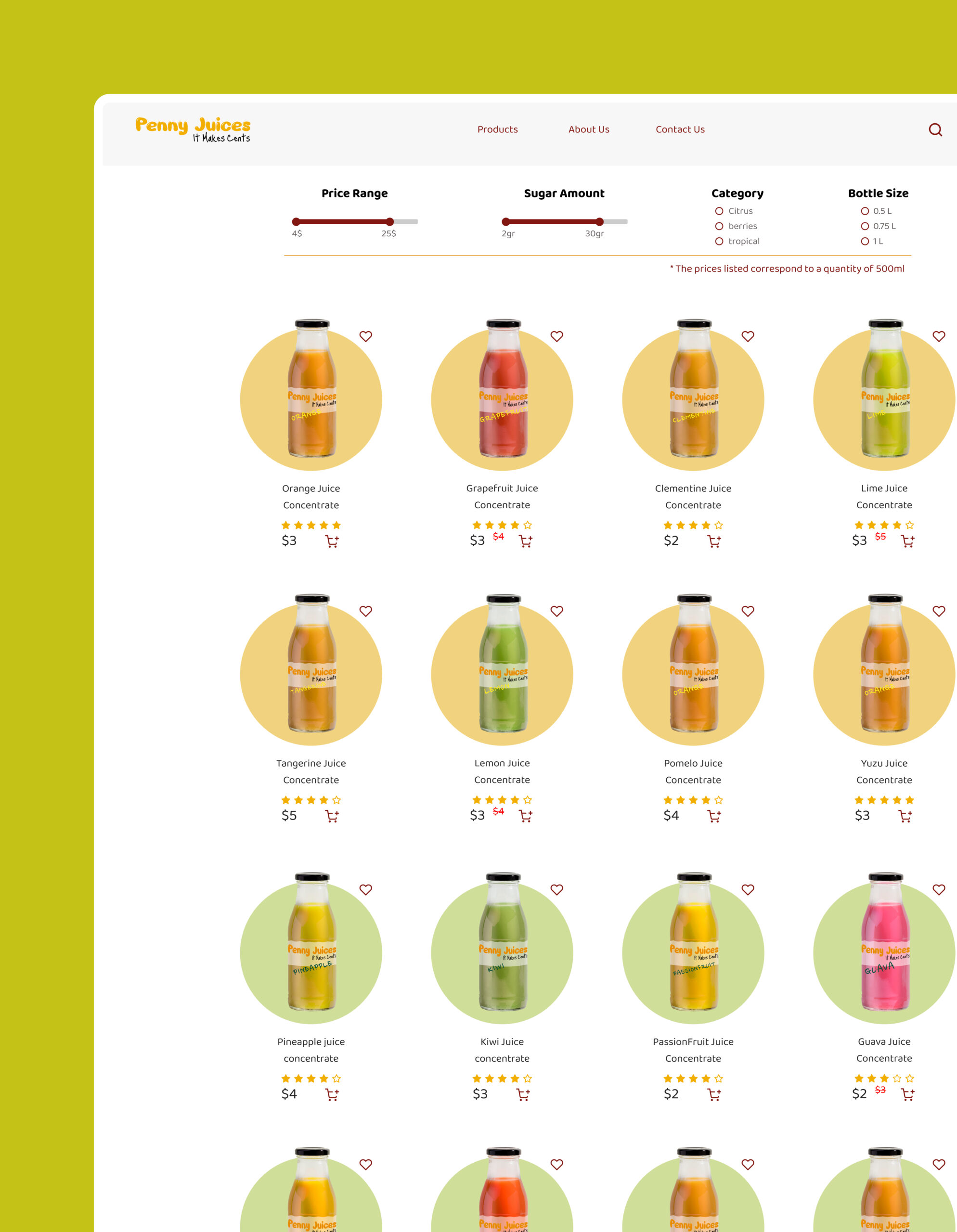
Products categories
Filter option
Division between the gallery, shopping cart and payment sections
User experience
Effective buttons
Organized information
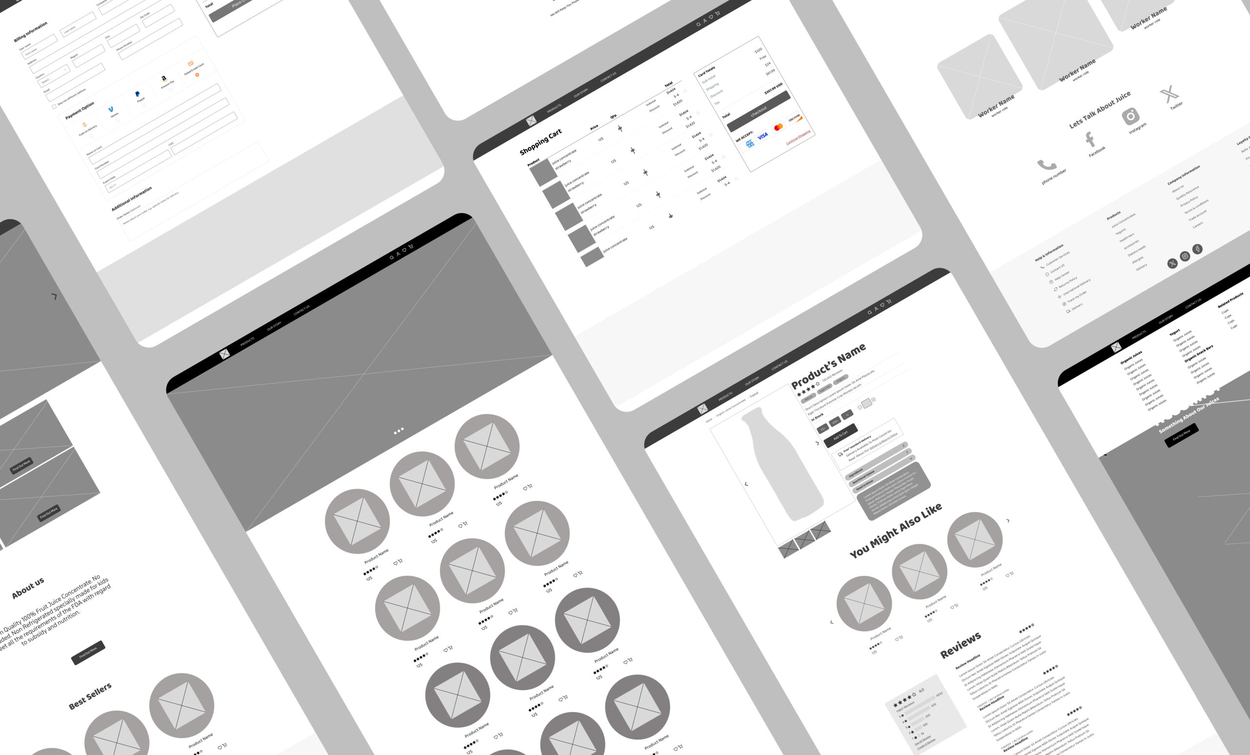
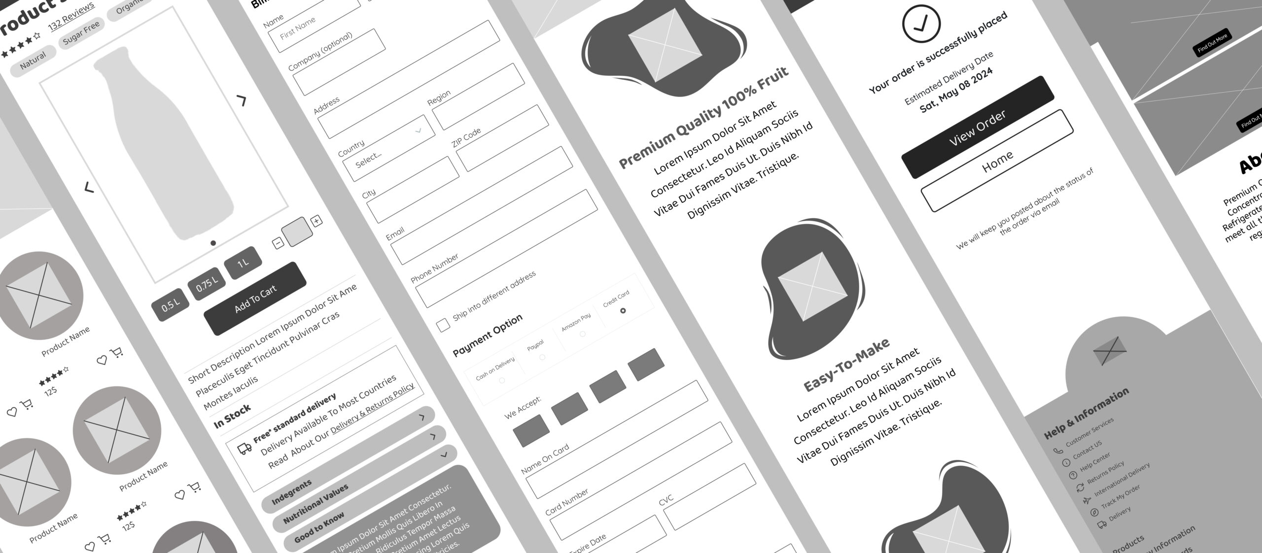
Organized and consistent Wireframes
Easy user flow
Empathize
Persona
Alice
43 years old, Merried +2
Oregon, Pennsylvania
About
Alice is a mother of 2 beloved kids, aged 12 and 8. She doesn’t order online frequently, but she wants her kids to drink healthy beverages with zero added sugar.
Wants
An organic juice concentrate manufacturer with a user-friendly website that allows easy ordering of multiple bottles at once. Each juice is accompanied by social proof and reviews.
Frustrations
The juice brands her kids enjoy have websites that are nearly impossible for her to navigate. Finding anything is a challenge, and the site doesn’t function properly on her phone.
George
24 years old, Single
Berlin, Germany
About
George enjoys fruits and juices, but he prioritizes maintaining a healthy routine and avoiding excessive sugar intake, so the fact that a juice is organic is crucial to him.
Wants
A reliable organic concentrated juice brand that can depend on, allowing him to easily order large quantities without too much hassle.
Frustrations
Most of the brands he knows add lots of chemical additives to their juice concentrate, which makes them not a viable option for him. Many of these websites are outdated and not user-friendly.
Competitors analysis
In order to understand the market and identify potential gaps and opportunities. This process also provided valuable inspiration for the next steps in designing the platform.
Concept development
User flow
Information architecture
Design
Wireframes
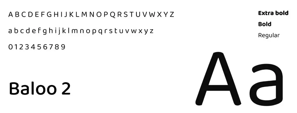
Typography
Design system
Iconography
#821611
#F7F7F7
#242424
#000000
#4D4A4A
#ADADAD
#F3AF00
Color pallete
Logo design
Old logo
Visual Element Old penny icon with no relation to the juice field.
Font Serious with harsh shadow, capital letters looking too aggressive.
Colors Red looks negative and doesn't transmits the spirit of the brand.
New logo
Visual Element No needed, logo based on font and colors which give the desired effect.
Font 2 fonts: The main font is cheerful with a little bit of 3d effect. The Slogan font is hand written by a child which makes the direct connection to the brand audience.
Colors The selected shade of yellow represents one of our freshly minted brand colors, evoking a sense of joy and nostalgia, perfectly aligned with our intention.
UI screens
Prototypes
Please press the icon "expand" for a better experience.